› Collateral Design
RBC Cybersecurity Hand-Out
Role
Graphic Designer
Caption
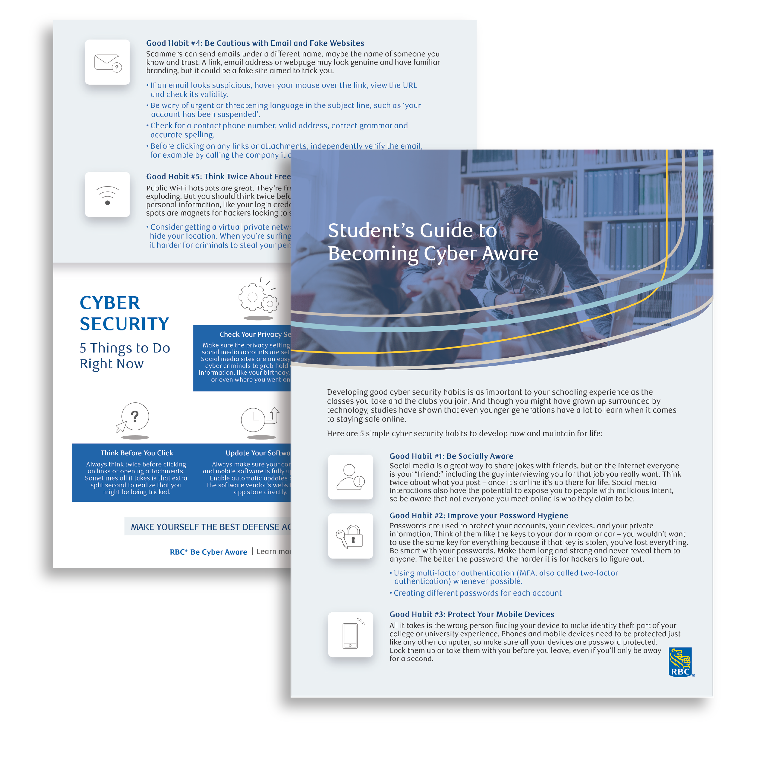
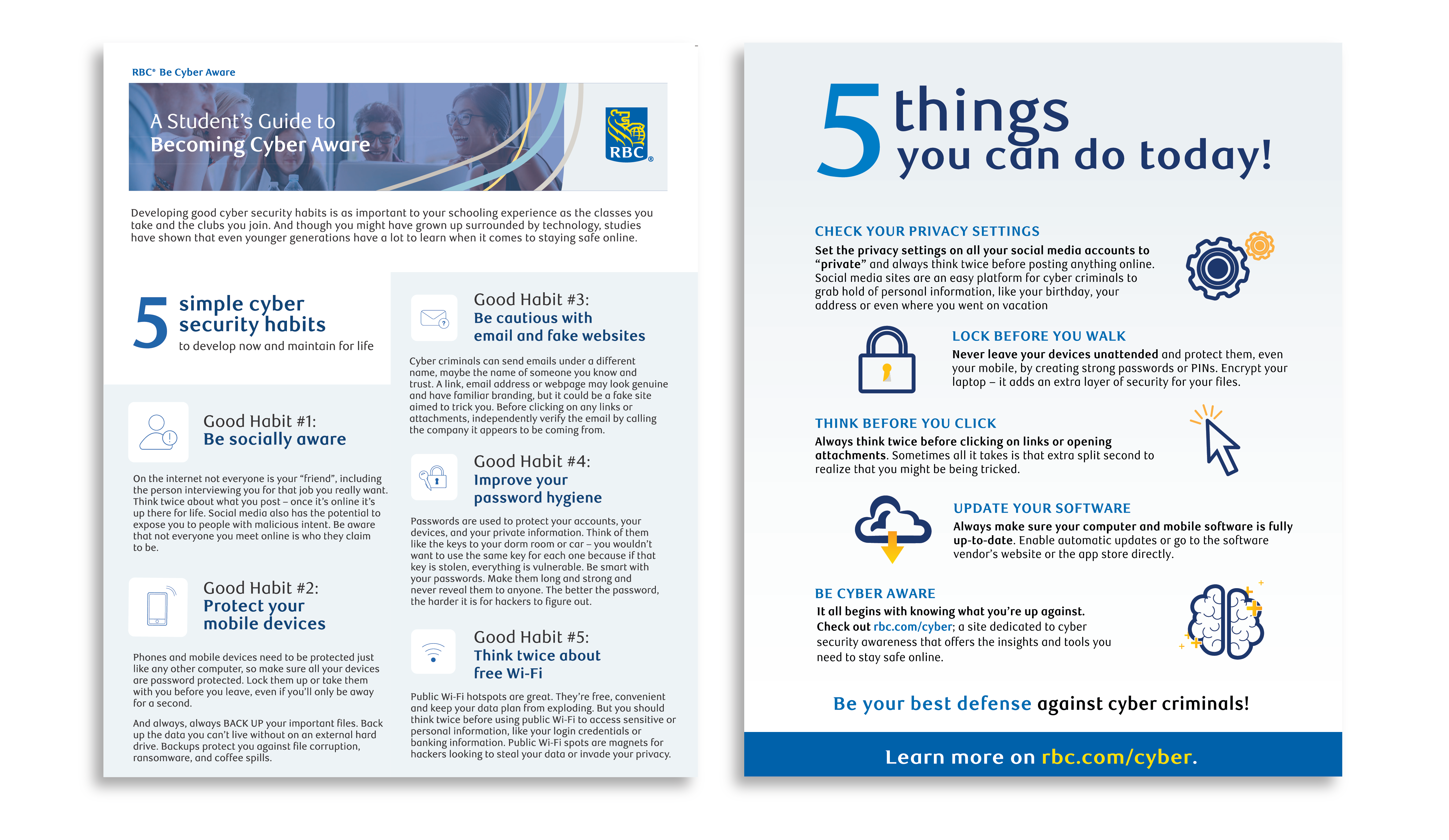
This is a co-op project. The attached image is the final look of the hand-out design that was distributed in the event.
Graphic Designer
This is a co-op project. The attached image is the final look of the hand-out design that was distributed in the event.
Creating an educational double-sided hand-out about cybersecurity for students in British Columbia.
Kirkland McNeill, the other co-op designer
Adobe Illustrator
3 weeks
Working in the Strategy Communications Team as a graphic designer co-op, my job was to promote and showcase technological achievements as well as information through the use of infographics and illustrations. Kirkland McNeill was the other designer co-op that I worked with during my co-op term.
The project was one of the major cross-team collaborations. RBC’s cybersecurity awareness team reached out to us and wished we could assist them in designing educational cybersecurity hand-outs for their upcoming student event in British Columbia. To promote RBC’s innovative technological side and their belief in supporting the future generation, being able to deliver an informative and friendly hand-out for the students became crucial.
This project demonstrated my ability to rapidly move through the design process under a tight deadline. Being able to effectively brainstorm and iterate was extremely important because the final design was going to be printed for an external audience. Every design decision had to be approved by other departments to ensure it adheres to the company’s image. Hence, efficient team dynamics and communication skills between my co-op colleague, Kirkland and I became exceptionally critical.
According to the guidelines, the drafts had to be sent to our supervisor and the cybersecurity team to ensure the style matched the cybersecurity team’s image. Afterward, the designs had to be forwarded to the corporate branding team to make sure our designs follow the company guidelines. This reviewing process tended to consume the most time. Moreover, the feedback between teams often differed from the initial requests; to ensure each iteration was on-brand and free from error, Kirkland and I had to work closely with the branding guidelines whenever we drafted anything new.
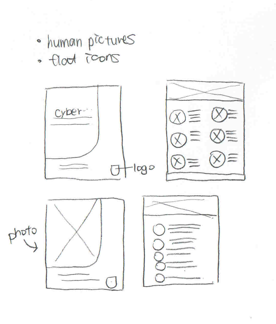
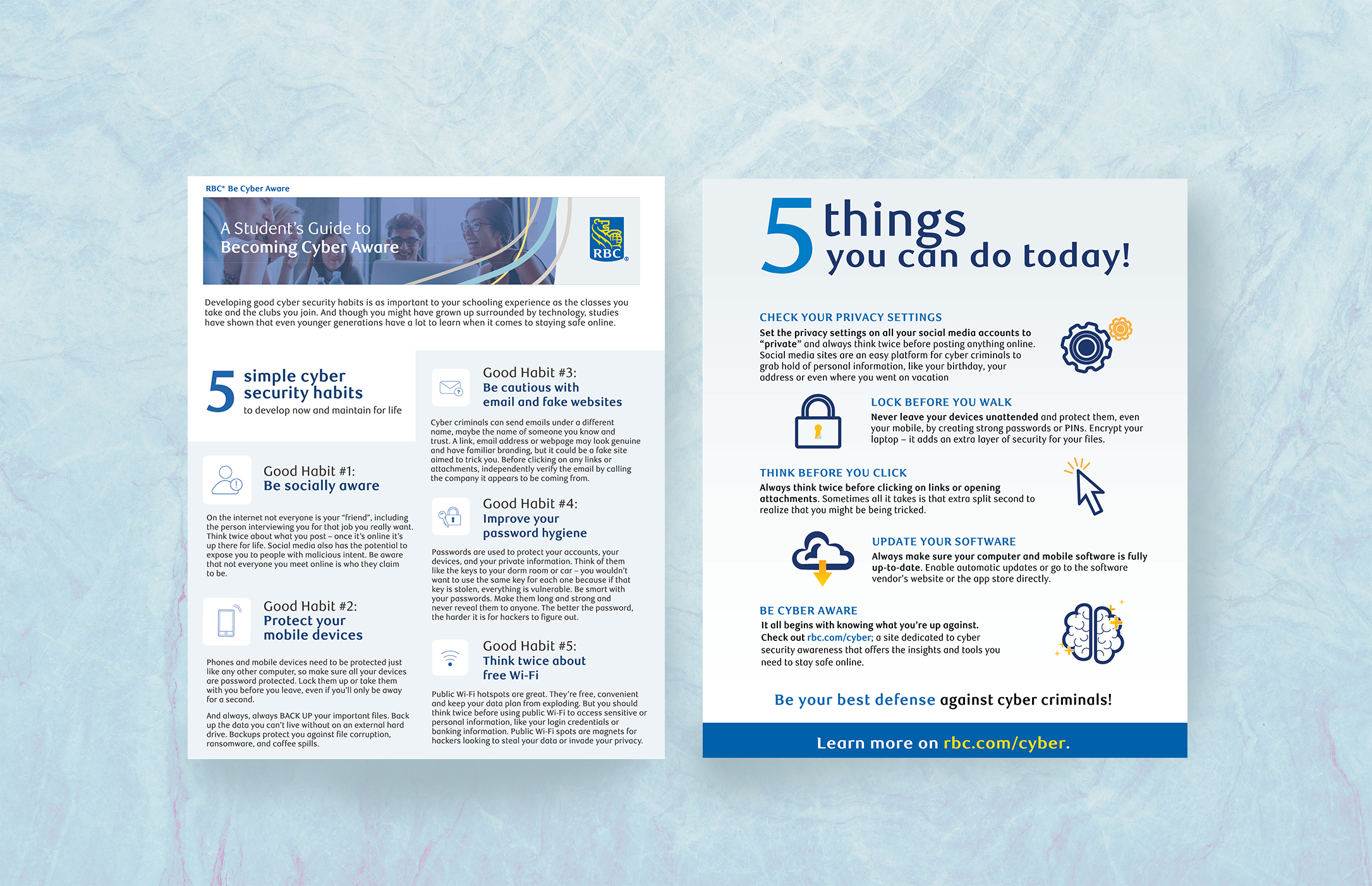
To accelerate the reviewing process, I conducted regular brainstorming discussions with Kirkland and aimed to design hand-outs that engage students and also represent RBC and the cybersecurity team professionally. I broke down the initial texts we received from the cybersecurity team. I sketched out drafts with appealing photos and playful icons that follow branding but at the same time, portray the cybersecurity team’s friendliness and client-focused vision (Figure 1 & 2). After the cybersecurity team’s first review, we received more hand-out information; the first draft was also simultaneously delivered to the corporate branding team for evaluations. I then communicated with Kirkland to group the information so that we could fit all the details into a double-sided hand-out. Kirkland was then in charge of making the security checklist; whereas I was in charge of designing security habits. The design style and the format consequently evolved into the second draft (Figure 3).
One of the major challenges I faced during the design process was the amount of the content not able to fit into a double-sided hand-out. Although we had grouped the information, there were still too many texts. To achieve an effective team collaboration and a seamless communicative process, I voluntarily initiated multiple design meetings with the cybersecurity team for quick amendments. This action allowed both sides to give immediate feedback which increased the overall efficiency.
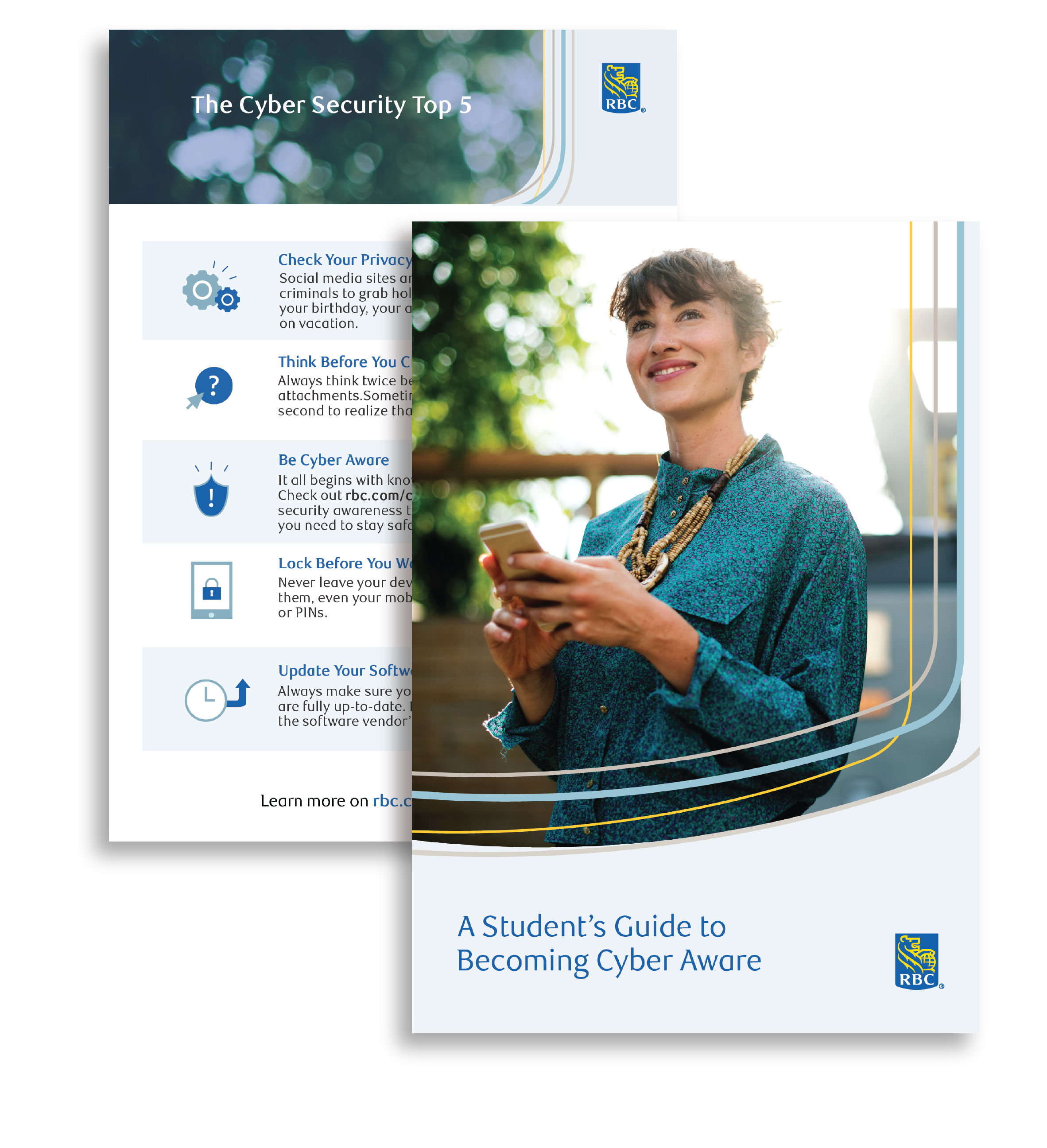
Moreover, RBC at the time was refreshing their company branding. Consequently, there were many unfinalized design guidelines. Kirkland and I struggled with this ambiguity but still tried our best to deliver the hand-outs on time. Nevertheless, I was able to constantly discuss with my supervisors and the cybersecurity team to minimize inaccurate branding decisions. I also tried searching for RBC’s past design booklet to aim for a precise and appropriate corporate personality (Figure 4).
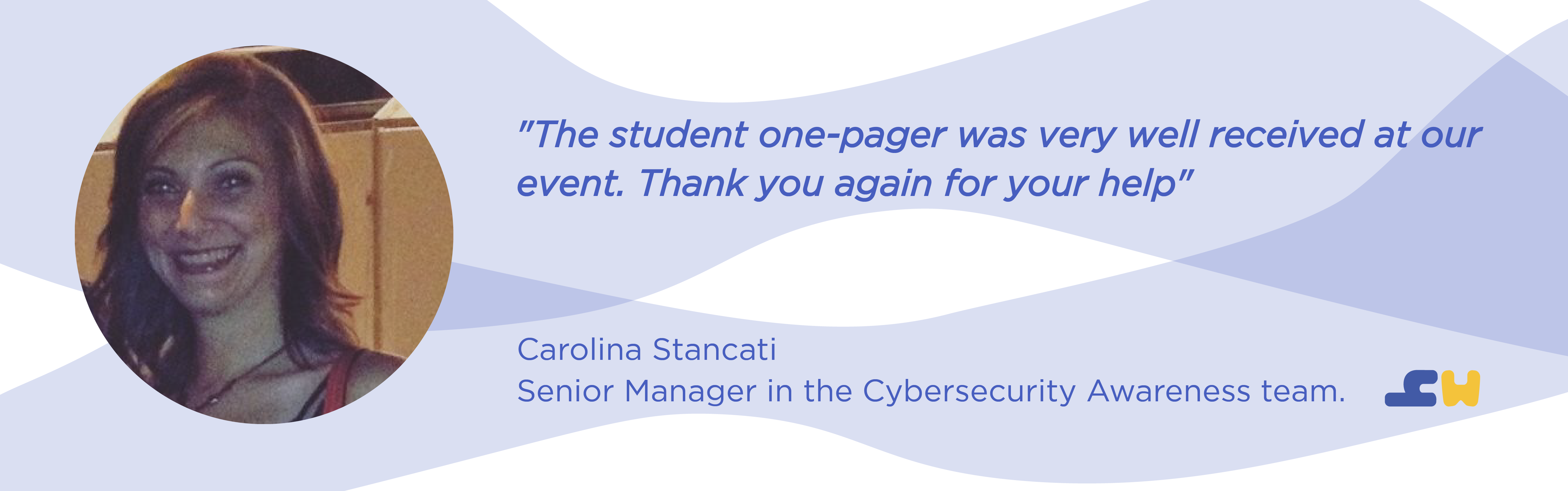
In the end, the cybersecurity student event in British Columbia was successful, and the cybersecurity team was very pleased by the outcome (Figure 5). From this project, I was able to understand how it felt like to work within a big corporation and create something impactful. It took me a while to comprehend the intention of carefully reviewing the design.
Because of this unique opportunity, I learned the importance of delivering an accurate corporate image via design, especially this cyber aware event was one of the attempts that RBC was doing to engage with the tech community. Thus, how designers build up the company image in a new field becomes extremely crucial. I am glad I was able to recognize the hidden values behind all the iterations. This project indeed taught me how to cautiously work with the company goal in mind.