›Branding Poster
FED's Ethnographic Poster
Role
Graphic Designer
Caption
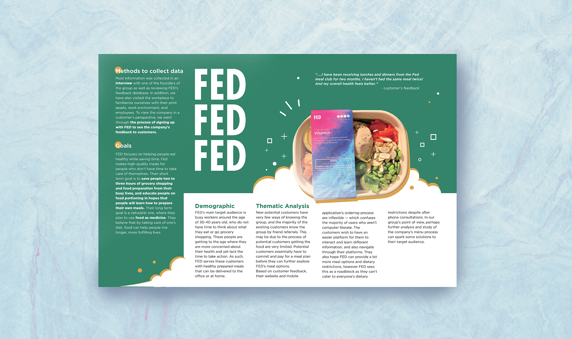
The attached image is a representation of the final poster.
Graphic Designer
The attached image is a representation of the final poster.

Giving FED, the dietician-based food start-up, branding suggestions via our academic ethnographic poster which could potentially help them connect with their potential customers.
Anthony Shek, Benny Huang, Damien Wang, Nicole Filipowski and Justine Zhang
Adobe Illustrator
1.5 weeks
This project is from the course, Interaction Design, that requires students to propose design solutions for a real-life client. In my team, I was in charge of visual design to deliver our findings.
My team was interested in community work. This was why we decided to reach out to FED, a dietician-based food start-up that upholds the value of “nutritional food plans can help people in the community stay healthy without medicine.” After our first in-person interview with FED, we found out that they wished to not be labelled as hospital food; FED wished our team could assist them in reaching out to more potential customers through redesigning their mobile application.
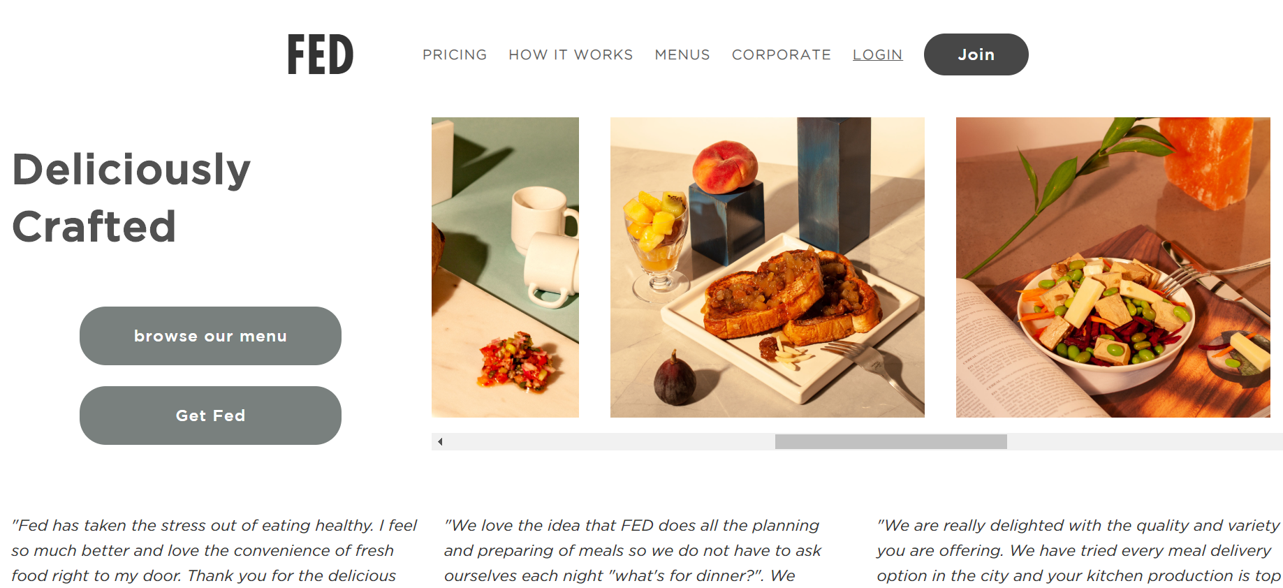
Nevertheless, I thought improving their mobile application was only one of the solutions that could tighten the connection between them and their customers. Based on my observation, I think their current brand direction was also one of the reasons why their customers felt disconnected from FED’s profession (Figure 1). Hence, my team split up: most of my teammates were exploring their beta version of the mobile application; I volunteered in redefining FED’s image and their branding using our ethnographic data poster. By refreshing their company image in our poster, our design could act as a base template for FED to consider whether they want to restructure their branding guidelines.
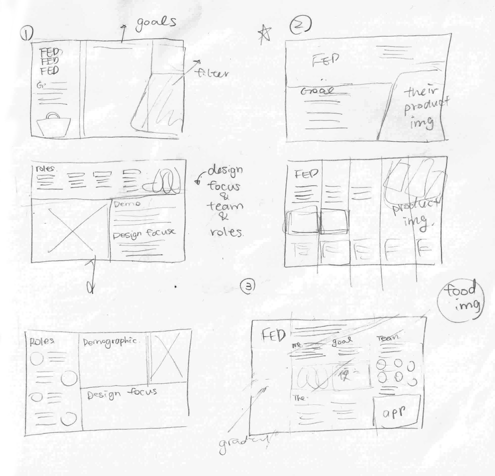
FED’s core value is improving people’s health by supplying them with healthy meals and professional dietary advice. To accurately portray this image, I created several sketches (Figure 2) that displayed clear images of FED’s products. What colour schemes I chose then became exceptionally crucial in this rebranding process because they could instantly encourage the customers to establish the right association; this undoubtedly became the major challenge that I encountered.
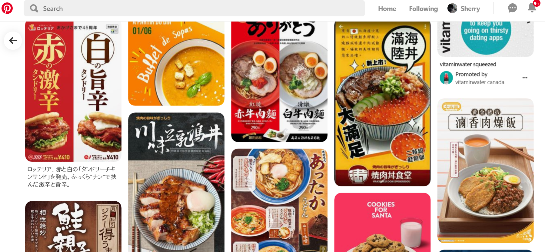
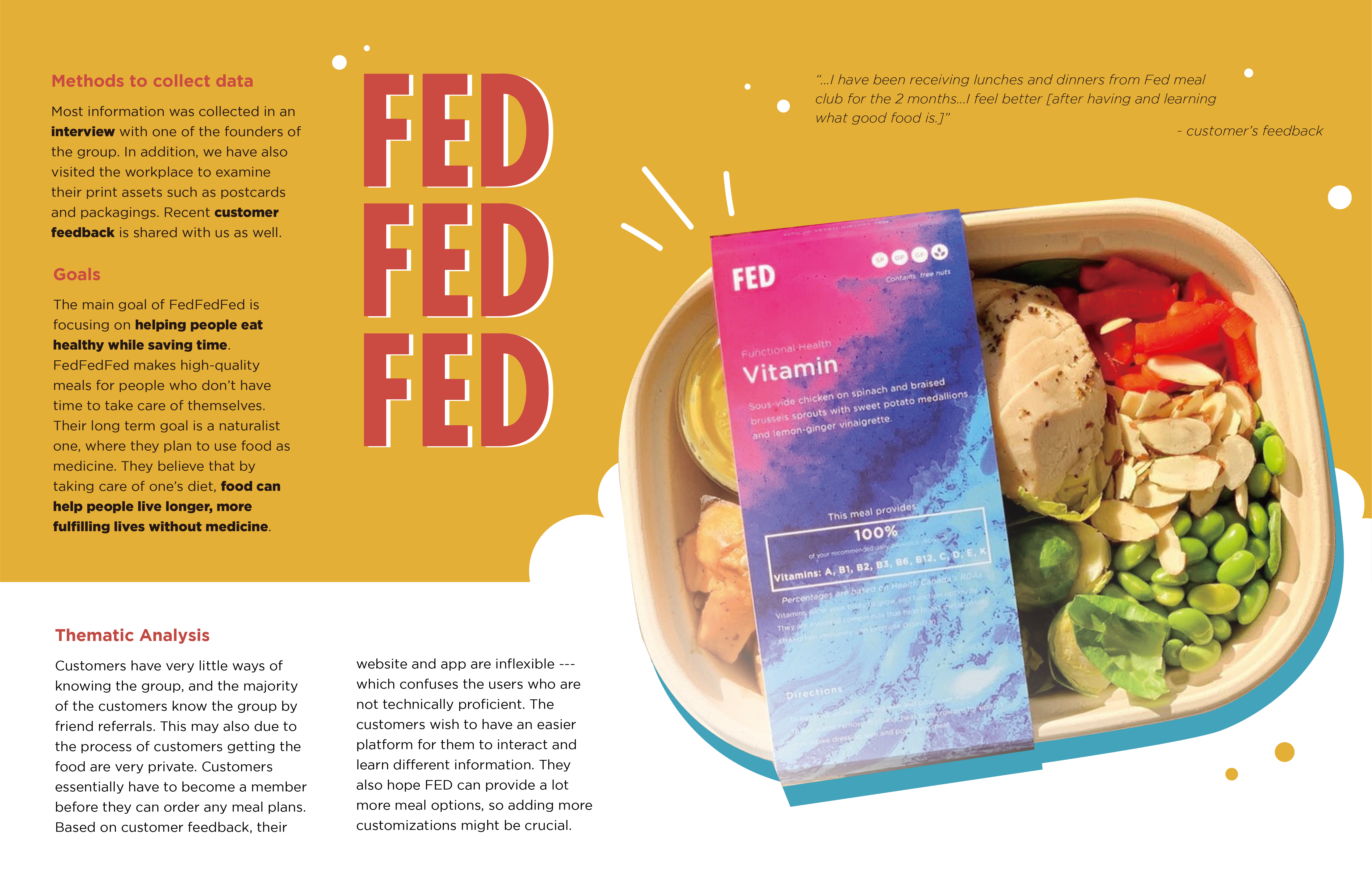
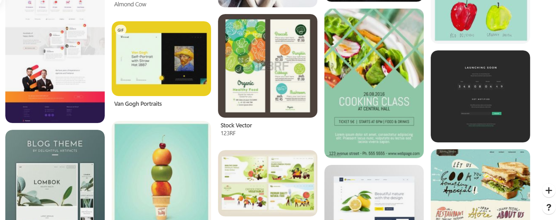
Since FED wished to associate themselves as someone creating nutritious and tasty recipes, I did a Pinterest search using keywords like “delicious food” to see how other precedents approached this concept (Figure 3). However, my initial attempt at constructing their personality failed to convey the right connotation – the poster in red and yellow looked like a fast-food pamphlet (Figure 4). According to my teammates, they thought the hierarchy of the ethnographic content, and the colour contrast was difficult to follow which might diminish FED’s credibility.
I refined my search keywords on Pinterest to “healthy food” (Figure 5) and created new colour schemes – using green as the dominant colour to represent the ideas of health and trust. FED wanted their customers to differentiate them from other clinical nutrition food services. Thus, I decided to add in yellow as one of the main colours to build a vivid and cheerful atmosphere; tiny graphics were placed near the product image to smoothly shift the customers’ eyes and establish a sense of positivity (Figure 6).
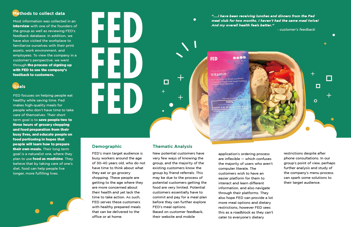
In the end, our ethnographic poster acting as FED’s rebranding template was presented in the class. People from my class did comment on how they were interested in knowing more about this service, and they were drawn to FED’s food products. Hence, our team decided to deliver this branding suggestion to FED after the project.
The outcome and the feedback I received from this poster were a learning moment. Branding represents a company’s personality and image – it also influences how potential customers think of the company. If FED took my first draft as advice, they could have created even higher customer confusion. Hence, I am glad I was able to catch this detail before delivering the poster to them.