›Maze Case Study
Supporting a Better Prototype Experience for Maze
Areas
UX/UI Design, Product Strategy, Prototyping
Caption
The attached image is a representation of the final mockup.
UX/UI Design, Product Strategy, Prototyping
The attached image is a representation of the final mockup.
My bootcamp teammate, Anita Hukkanen
Figma, Figjam and Typeform
1 month
Maze, a research/insight testing platform, was looking for ways to improve its current main workflows. Their main feature is the so-called "mission block" where researchers or designers can input their prototype link for their designated testers to go through. Currently, Maze has difficulties in improving the mission block workflow as well as supporting their researchers/designers to ask follow-up questions. Hence, looking for ways to support this goal has become the main goal.
We discovered Maze's interface had many components that will create visual confusion. If we could decrease the amount of visual confusion, we can improve users' experience. Nevertheless, we decided to first understand our users' pain points and expectations when they conduct prototyping/usability tests to validate this workflow redesign is necessary.
Maze's business goal aligns with users' expectations. Hence, my team utilized mind-mapping to brainstorm new solutions to improve the status quo. In the end, we came up with a "duplication feature" where the users can duplicate sample questions from Maze's templates to set up proper and meaningful mission blocks and follow-up question blocks. We also incorporated a follow-up button in the edit panel to invite the users to add relevant questions or sample pre-designed questions. A bookmarking feature was also introduced so that users can mark specific screens and re-add them in the follow-up questions. This cost-effective solution also offers our users more guidance when creating their own usability tests.
Jump to check out the prototype
Due to time, my team wasn't able to conduct usability tests but I am planning to set up one and create task scenarios such as:
"You are a designer who just builds a mobile app. There is a special feature in the task flow you would love to gain more insights into. Explore ways to input your prototype and ask relevant follow-up questions for your feature/prototype".
for future iterations. The success of this redesign will be measured in these aspects:
1) whether the relationships and representations of all the buttons, icons and features are clear enough.
2) how much support the users feel when they are completing the task.
3) whether the user flow or the way we introduce/structure the content and features are smooth enough.
This case study is from the UX/UI bootcamp, Memorisely. We collaborated with Maze, an online prototyping/insight collecting platform, to help improve their main services. Maze's main feature is the so-called "mission block" where researchers or designers will input their prototype link and design meaningful survey questions. Maze reached out to Memorisely and wished the bootcamp students can shed new light on their current mission block workflow. How we could improve the current feature flow while also supporting researchers/designers to ask follow-up questions about their prototypes became the main goal.
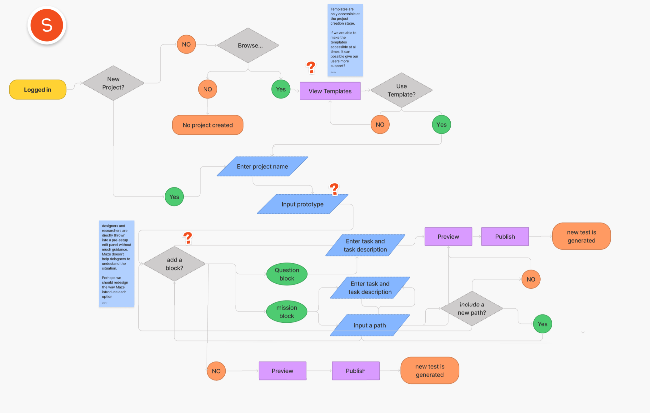
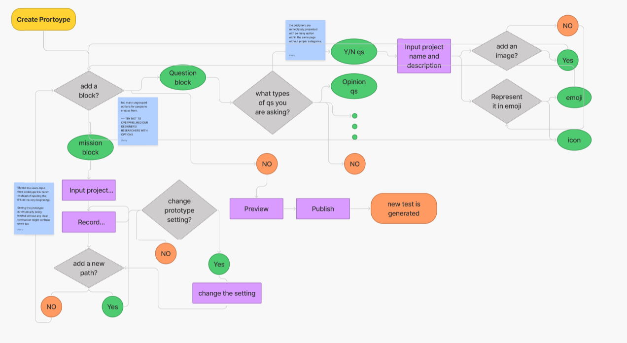
Before doing anything, it is important to observe the existing interface of Maze. To easily document the process, I use the structure of [situation], [response], [problem to business or experience] to ensure I'm aware of users and business needs. Doing these observations also allows me to understand whether Maze has any pressing problems that can become new opportunities for refreshment (Figure 1).
During the observation process, I noticed Maze has compacted so much information in the editing screen after the users create their projects. The editing screen is divided into 3 columns with multiple highlights to attract the users to engage with them. If we closely observe the interface, we notice the users are faced with at least 7 highlighted touchpoints calling them for interactions. Each column has multiple either unlabeled or ambiguous interactive components (Figure 2). The relationship between the middle column and the right panel is even more unclear when the users are inputting content.
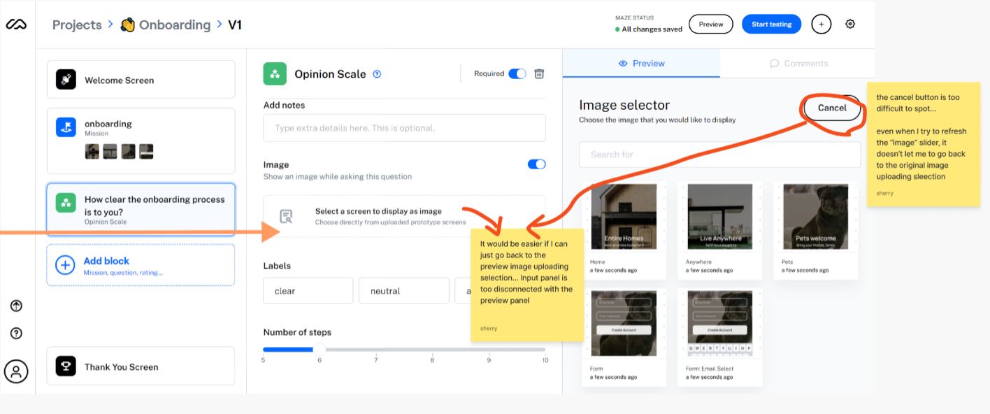
For instance, when the users decide to import an image into the question block, the users have to go to the right column to select the images. However, when the users want to cancel their selection, the "cancel" button is surprisingly located on the top right corner away from the middle column (Figure 3). It took me several tries to discover how to undo my action. Overall, it is unclear that what the meaning of the right column is — is it a preview screen for the entire survey? or a file selection area? The ambiguity introduces more confusion to the users.
I then went on creating the observation and assumption summary. I described the points I considered contributing to the general poor navigations and tasking of the main mission block workflow (using the structure mentioned in the previous paragraph):
When [users first enter into the process of creating a project],
Users [are thrown into Maze where it forces the users to click around to explore the tool. Instead of informing users where they are, Maze makes the users read through the crowded/ unclear buttons, descriptions and guidelines],
Which [might increase cognitive load and annoy users' experience].
When [users first enter into the process of creating a project],
Users [are introduced with numerous controls or buttons that are unlabeled or have inaccurate representations],
Which [might confuse the users on what the next step is when they are trying to test things out].
When [users first enter into the process of creating a project],
Users [are introduced to an inconsistent edit input panel and preview screen that have a vague relationship],
Which [occasionally confuses the users on where to find the meaningful control and display].
After discussions with my teammate, we thought Maze's interface could be improved tremendously to help the designers or researchers using Maze have a smooth workflow. Naturally, we would want to validate whether or not this was how the users felt. However, sometimes the business goal doesn't necessarily align with the user's need. To ensure users' need is the same as Maze's, we then decided to set our research direction broader to collect as many responses as possible to understand how we can combine users' goals with Maze's vision. Hence, the research direction is broad in this case to gather general feelings about doing remote prototyping:
Research Goal:
To understand what users know about usability testing and what their expectations are specifically for remote testing
→ so we can embed their expectations into our interface and most importantly, our mission block flow.
To confirm our observations and assumptions, each of us designed several versions of the survey to receive a variety range of replies.
Check my survey questions
→ this survey was to generally understand what our users think about different forms of prototyping and testing
Check my team survey questions
→ this survey asked our users their feeling towards usability tests. By doing this, we can indirectly receive feedback on users' mental models and thoughts about conducting a testing
Having shared my survey with users who conduct usability tests/prototyping, the next stage of my case study was focusing on synthesizing the data to recognize trends and form a hypothesis. During the synthesis, I segmented user responses and used an affinity map (Figure 4) to prioritize the problems of users.
Please check the following links for more details:
Check My Team Survey Results
Check My Personal Survey Results
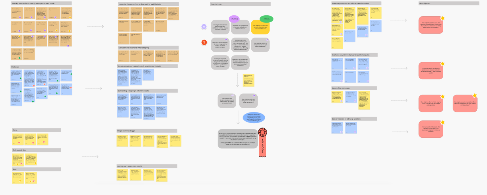
Major themes that came out of the affinity map include how researchers/designers usually have a clear goal of what they want to test, the concerns over how to ask good follow-up questions/task flow and how they tend to be able to receive more insights through synchronous moderated testing.
Originally, my team would love to focus on the primary frustration which is how Maze lays out its interface in this case; however, early on in the process, we thought the root cause must be embedded underneath the visual. It was also why we thought it would be better to understand what our users expect from doing usability testing.
We found two concerns that we could assert our influence to improve the fundamental experience of the interface:
1) How might we help designers/researchers to establish enough usability test context/hints?
2)How might we assist our designers to ask the right follow-up questions just like they are conducting synchronous testings?
If we look closely, we will discover that these two concerns overlap with Maze's business goal of improving the mission block interaction. We can now say Maze and our users have the same vision.
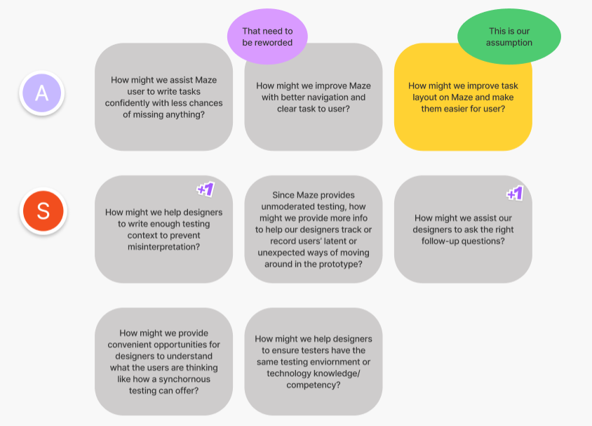
I then led the team to decide on the next design direction. Based on the affinity map pattern, it seems like designers/researchers who conduct usability tests are generally confident about their prototyping intention. They are just feeling unsure about whether they clearly portray their goals. We later found out Maze has pre-made templates that can give people options on what questions or formats they want to use. Other than making the template option more accessible, I suggested to my team to focus on supporting our users to ask the right questions after they input the prototype link.
Next Design Direction: How might we assist our designers/researchers to ask the right follow-up questions?
We then used mind-mapping to brainstorm and then narrowed down again on our main how-might-we question (Figure 6).
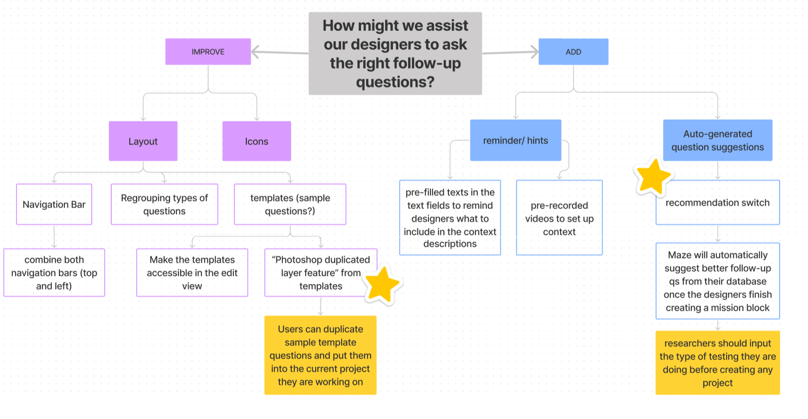
Since our users would love to have guidance on how to ask the correct follow-up questions, I initiated meetings with my teammates to brainstorm on possible ways to support users' actions. Originally, we came up with a solution of developing a "recommendation switch." When the switch is on, Maze would auto-generate follow-up questions (Figure 6). However, our bootcmap mentors commented that this kind of solution would be expensive. Hence, we moved on to iterate on how to represent the same idea in another form.
As mentioned previously, Maze's templates are already built-in to assist our users with content, questions and format. One drawback to this feature is that the template is only accessible when the users create a new testing project. How we can access the information that Maze already provides to solve users' pain point of not knowing how to ask a good follow-up question became the main topic we had to brainstorm on.
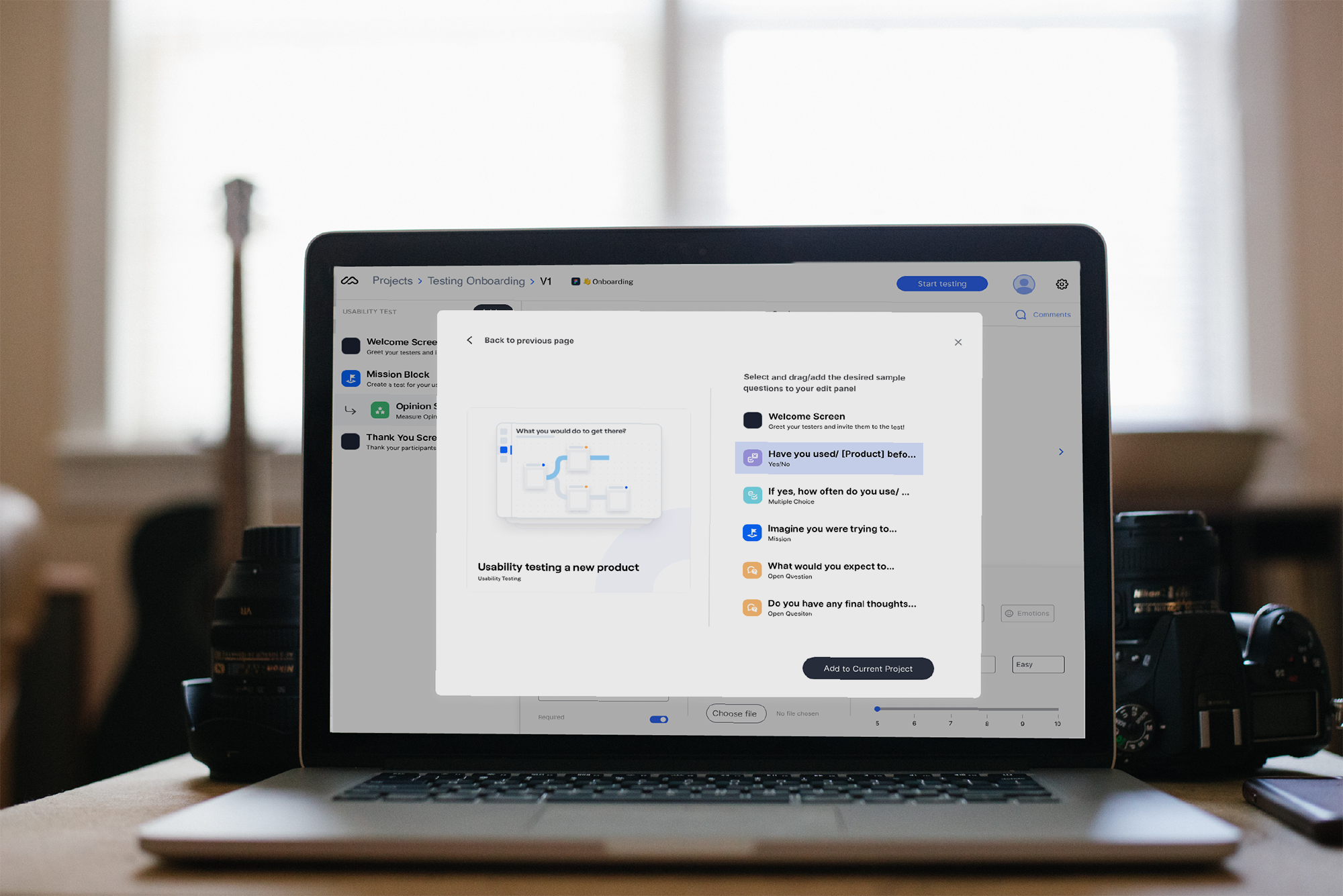
I then suddenly recalled Photoshop has a feature allowing duplication of certain layers or components across different files. Therefore, I brought up the idea of "duplicating the sample template questions to the current testing file our users are working on" (Figure 6). By doing this, it forces the templates to be accessible to the users at all times. This design also helps our users determine what good questions look like.
In Maze's current interface, users can access all prototype screens to their follow-up questions. I took a step further to enable our users to mark specific screens in each prototype task. That way, when users create follow-up questions, they don't have to look through all possible prototype screens to find the specific steps that they want to investigate. This duplication solution and bookmarking feature cleverly solve the concerns of not having enough context for the whole prototype and follow-up questions and also act as a blueprint to engage with the testers meaningfully.
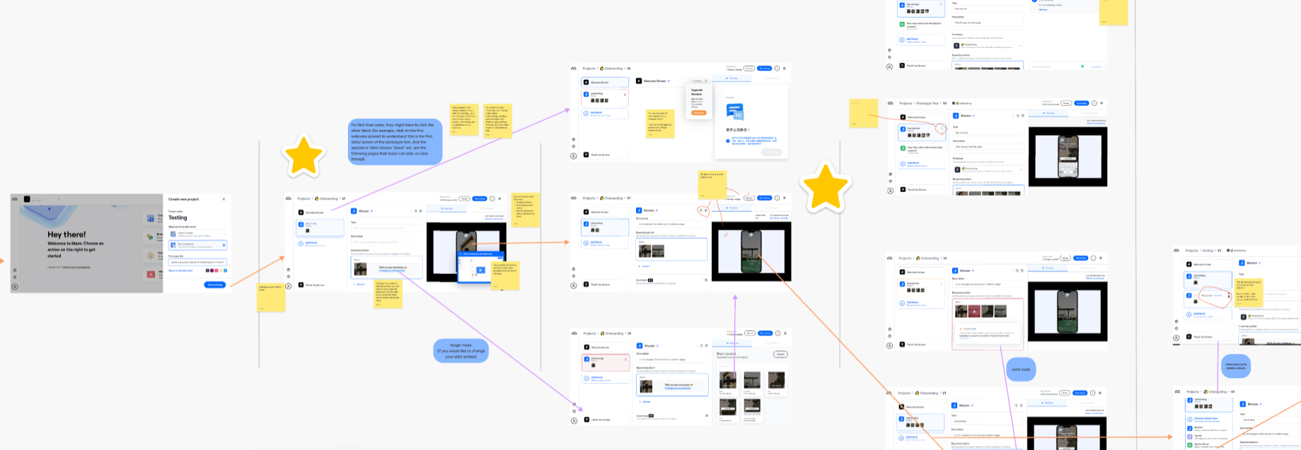
Following Ideation, I created user flows of the existing experiences (Figure 7 & 8) and improved the flow based on the idea that fit with business and user goals(Figure 9).
To create the improved user flow, I then defined a new user story to frame the scope of the new flow:
User Story
As a UX / UI Researcher,
I want to be able to create usability tests easily with follow up questions
So I can receive clear feedback on my product.
To fulfill the above user story, the new sample question duplication feature is included to support users' goal of asking a better set of questions. When the users want to incorporate a follow-up question in a mission block, they can also bookmark specific screens of the prototype and bring them into the questions for context. Sample question option is also available during the creation of follow-up questions.
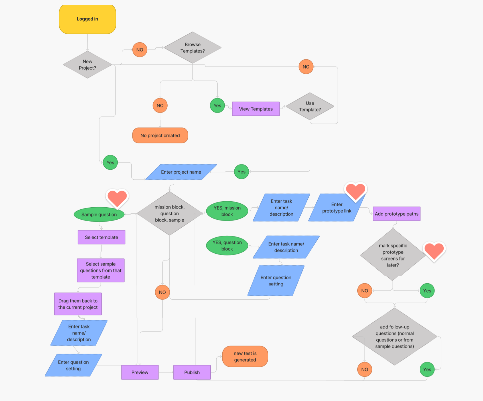
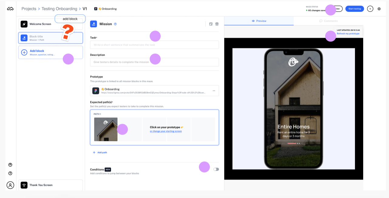
After knowing where to place the new feature for our users, I led the team to iterate the overall interface design. As mentioned in the "Fresh Eye Audit and Observations" section, there are many visual confusions embedded in the current Maze interface. To improve the experience, we removed ambiguous labelling/buttons, the overwhelming numbers of mission block types in the "add block" button on the left column and an unclear edit-preview screen. An interface redesign with obvious touchpoints, a focused content edit area and a simple survey preview screen was created to guide the users to have a focused experience (Figure 10 & 11).
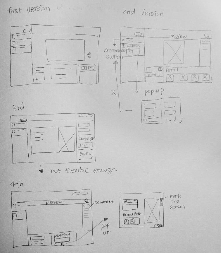
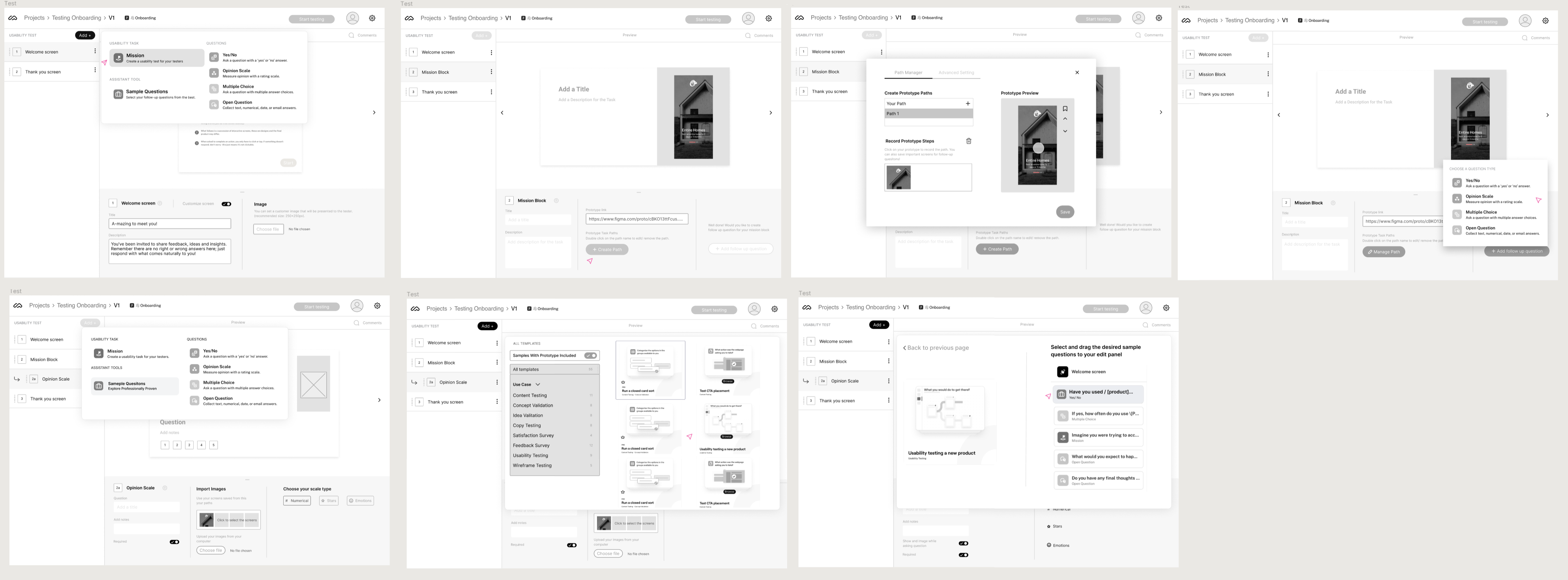
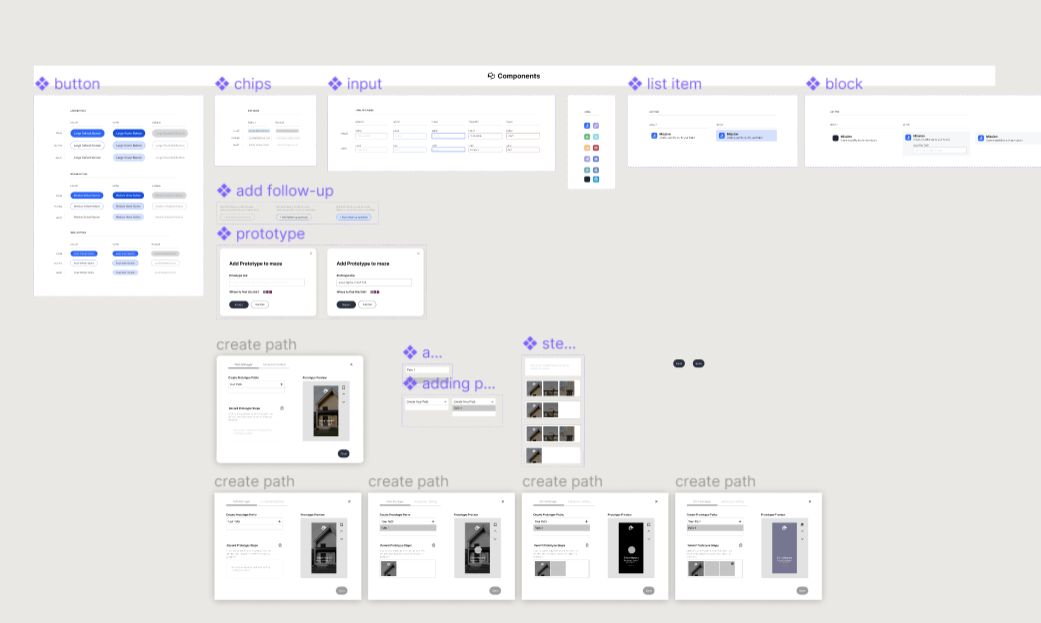
The lo-fi prototype helped me recognize frustrations with the experience that I improved at the hi-fi stage. To create the high fidelity prototype I inspected the product's style and followed the 8pt rule to effectively and easily create a prototype that was consistent with the product styling. Before creating the prototype I defined styles and components to easily and quickly help me design consistently (Figure 12).
The project was later on presented in the bootcamp showcase and it was well-received. Although due to time constraints, my team wasn't able to conduct a usability test, we are actually trying to prepare for a usability test to see whether our design decision optimizes the process of adding a mission/asking follow-up questions.
I am planning to set up task scenarios such as:
"You are a designer who just builds a mobile app. There is a special feature in the task flow you would love to gain more insights into. Explore ways to input your prototype and ask relevant follow-up questions for your feature/prototype".
to see whether my team's design meets their needs. The success of this redesign will be measured in these aspects:
1) whether the relationships and representations of all the buttons, icons and features are clear enough.
2) how much support the users feel when they are completing the task.
3) whether the user flow or the way we introduce/structure the content and features are smooth enough.