›Website Refresh
Paladin Security's Website Revamp
Areas
UX/UI Design, Content Strategy, Holistic Approach, Prototyping
Caption
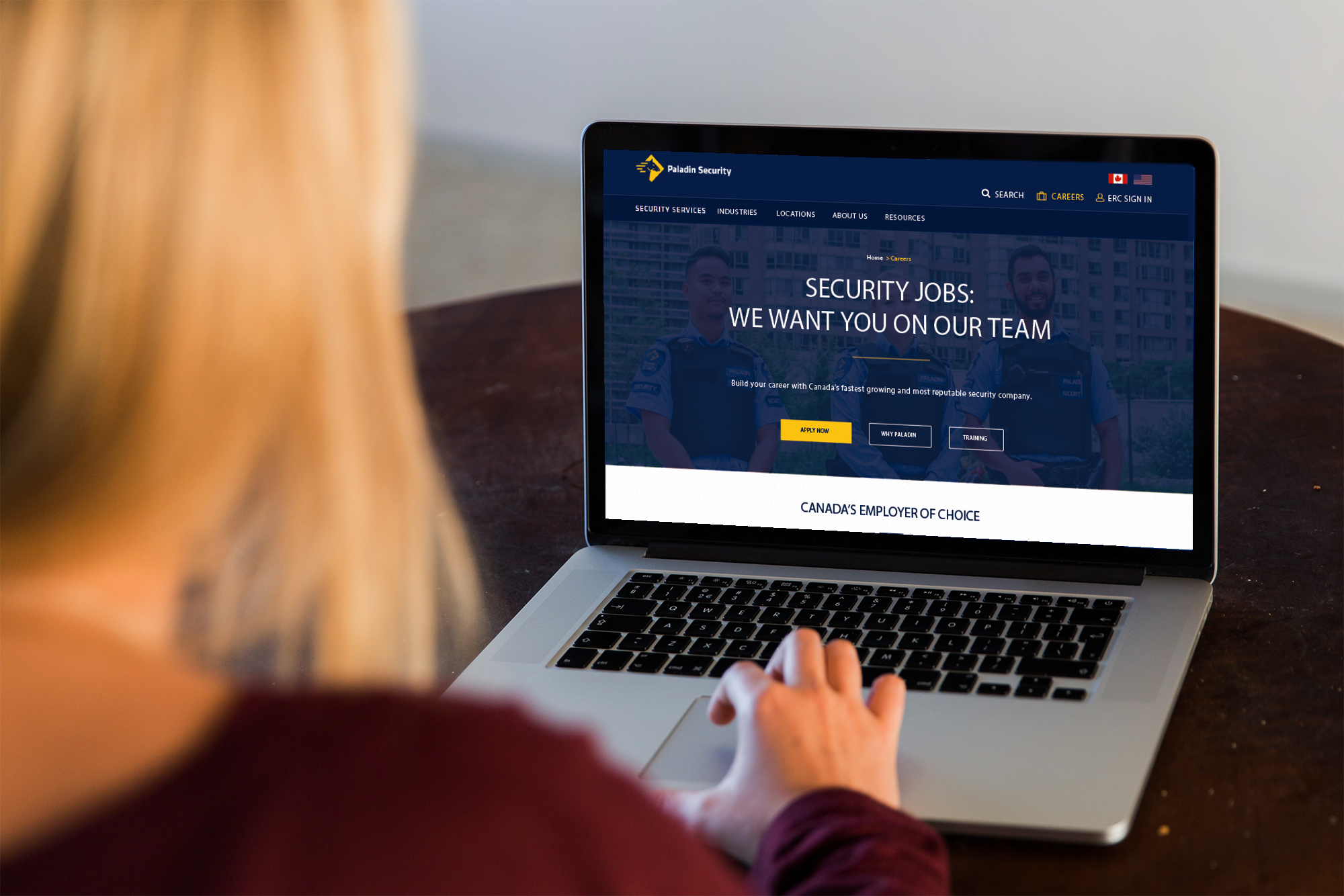
The attached image is a representation of the final website.
UX/UI Design, Content Strategy, Holistic Approach, Prototyping
The attached image is a representation of the final website.
Paladin had been struggling to recruit new security professionals. People didn't know about Paladin's culture and opportunities. Furthermore, they tended to call or email Paladin for general inquiries and job opportunities instead of browsing the website. How we could help Paladin reestablish trust via their website (specifically the homepage and the career page) became the main scope of the problem.
3 months
Figma, Figjam, OneNote and Illustrator
The company wished to find out the possible root problems that caused low website engagement on the homepage and career page to help with the recruitment. Due to the time, budget and confidentiality, this project didn’t have the chance to include a direct user interview; however, to estimate the research direction and verify the assumptions, I took an informal holistic design mindset to investigate what state Paladin’s website was at and the opportunities we could possibly offer. To do so, I first examined the website analytics and job applicant profiles compiled by the marketing team to understand what and how the users might be having trouble. Informal competitor analysis and an estimated version of journey mapping were also conducted to explore how the old information architecture and content representation were disrupting web visitors’ trust towards Paladin.
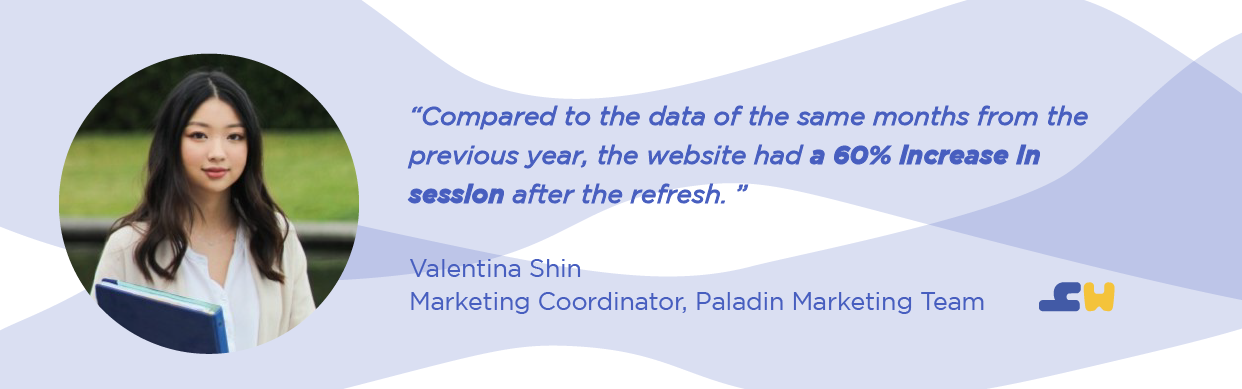
New information architecture diagrams were developed to structure the content order. Designing with the holistic design idea in mind, the new information architectures also have become the foundation for future content refreshes. The new website is also structured with clear sections, visual representations and buttons to signal relevant content for the web users — specifically for the job applicants. Although further usability testing and iteration are needed, because of the collective efforts, the website had a 60% increase in sessions after being live for the first 2 months (Figure 1).
An informal design system document and mobile version of the website using Figma were also developed as an extra step to ensure functionality and consistency.
Paladin Security is Canada's leading provider of security services. I worked as the only Visual & UX/UI Designer in the marketing team overseeing all the design work across Paladin and its group of companies.
Helping Paladin to refresh their web homepage and career page was the most difficult UX/UI project that I have worked on. It was because we didn't have the time and budget to reach out to actual users to validate our design decisions. The only thing we could do was roll out our design quickly and collect insights in real-time.
Nevertheless, this experience has taught me how to explore the project with a holistic design mindset; it invited me to consider how the website might mean differently to different stakeholders under different constraints. Because of this mindset, I was able to communicate my thought process clearly to my team by involving them in each step and looking at the problem from a different angle to discover new opportunities. Most importantly, this approach also had inspired my team to collaborate with one another to create more goal-oriented opportunities. The project also has taught me how to strategize approaches to verify my design assumptions — which is something valuable when the team has to work under constraints.
Paladin had been struggling to recruit new security professionals. The HR team collaborating with the marketing team had strategized different social media campaigns to invite more engagements online; however, many job applicants still did not know much about Paladin's opportunities or services. There was a tendency of people to call the company office for information instead of finding the information on Paladin's website. This user behaviour had been putting much stress on the HR and the marketing team. Hence, because of the company’s need, the website refresh project’ specifically for the homepage and the career page, was initiated.
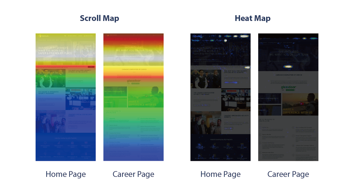
Before proceeding, I looked into the website analytics to observe how our website users interact on these two pages. It was surprising to see how people seldom interact or read through our website. Figure 2 is a screenshot of the user engagement heat maps and user scroll maps. A huge section of the web pages was covered in blue/green in the scroll map which implies low interaction to either the content or its representation. This indication shed some light on the direction we had to prioritize — content improvement.
Before taking any action, I reached out to my team to check whether there was any generative research about our users or job applicants applying to Paladin. I was then given a document of applicant profile where it listed out three different groups of people that interact with Paladin's job opportunities and services. The main groups were: the new generation of law enforcement graduates, immigrants with law, military or security backgrounds and career transitioners. Although reaching out to these groups of people to conduct further interviews is more ideal, I wasn't able to perform any of the research due to budget, confidentiality and time.
To best estimate and propose the next direction, I closely examined the applicant profiles and had meetings with the entire marketing team to further understand who these applicants were and any potential ways to pinpoint their major pain points.
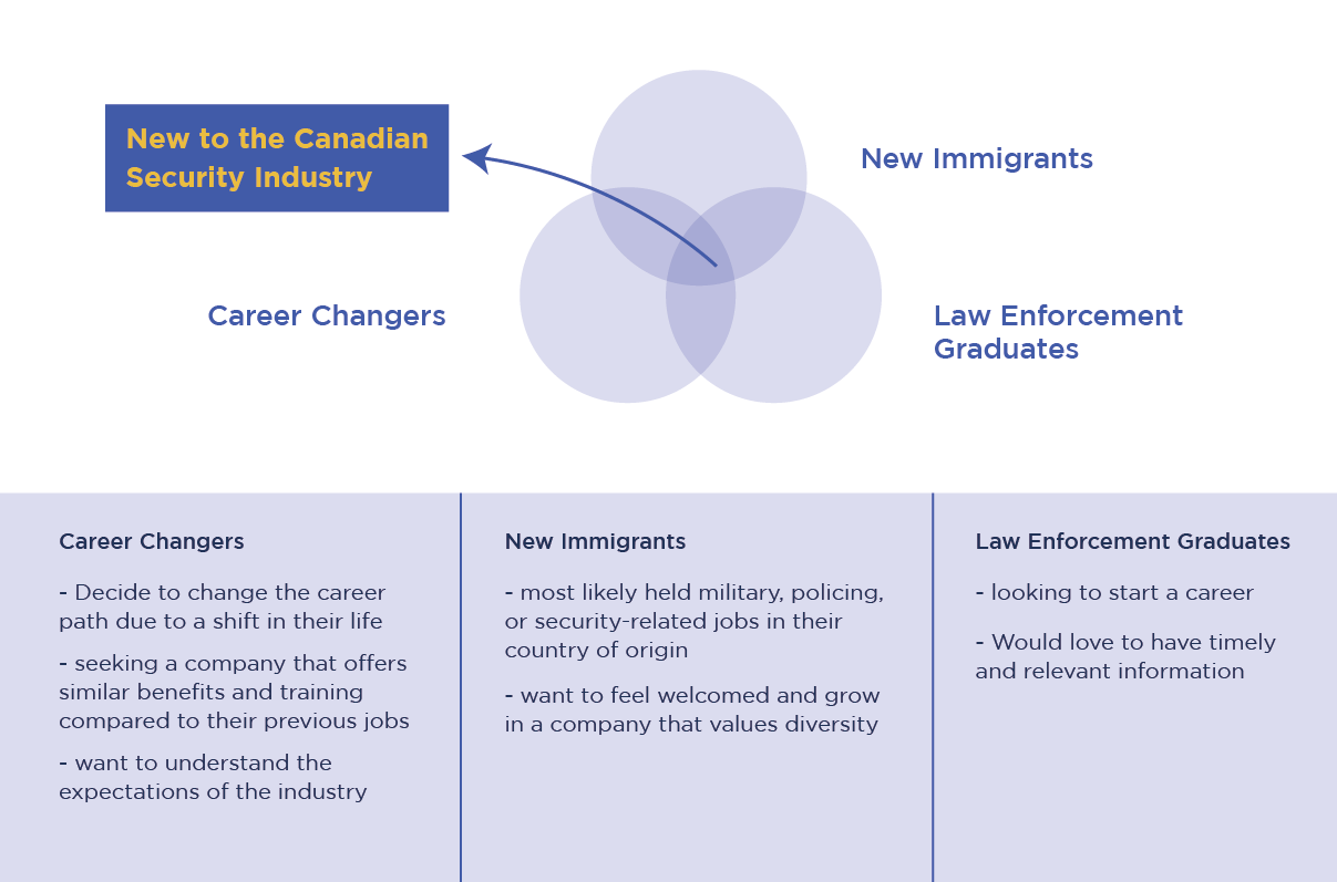
I discovered our main applicants had one major thing in common — most of them are new to either the industry or the country (Figure 3). This piece of information suggested that these job applicants possibly need more information than just having a usual job description. If I am able to tackle the common problem for these three groups, the impact of this refresh project would be more prominent.
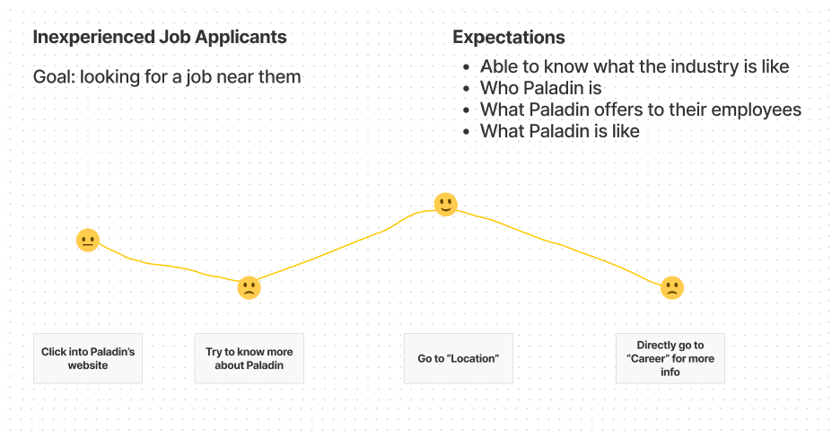
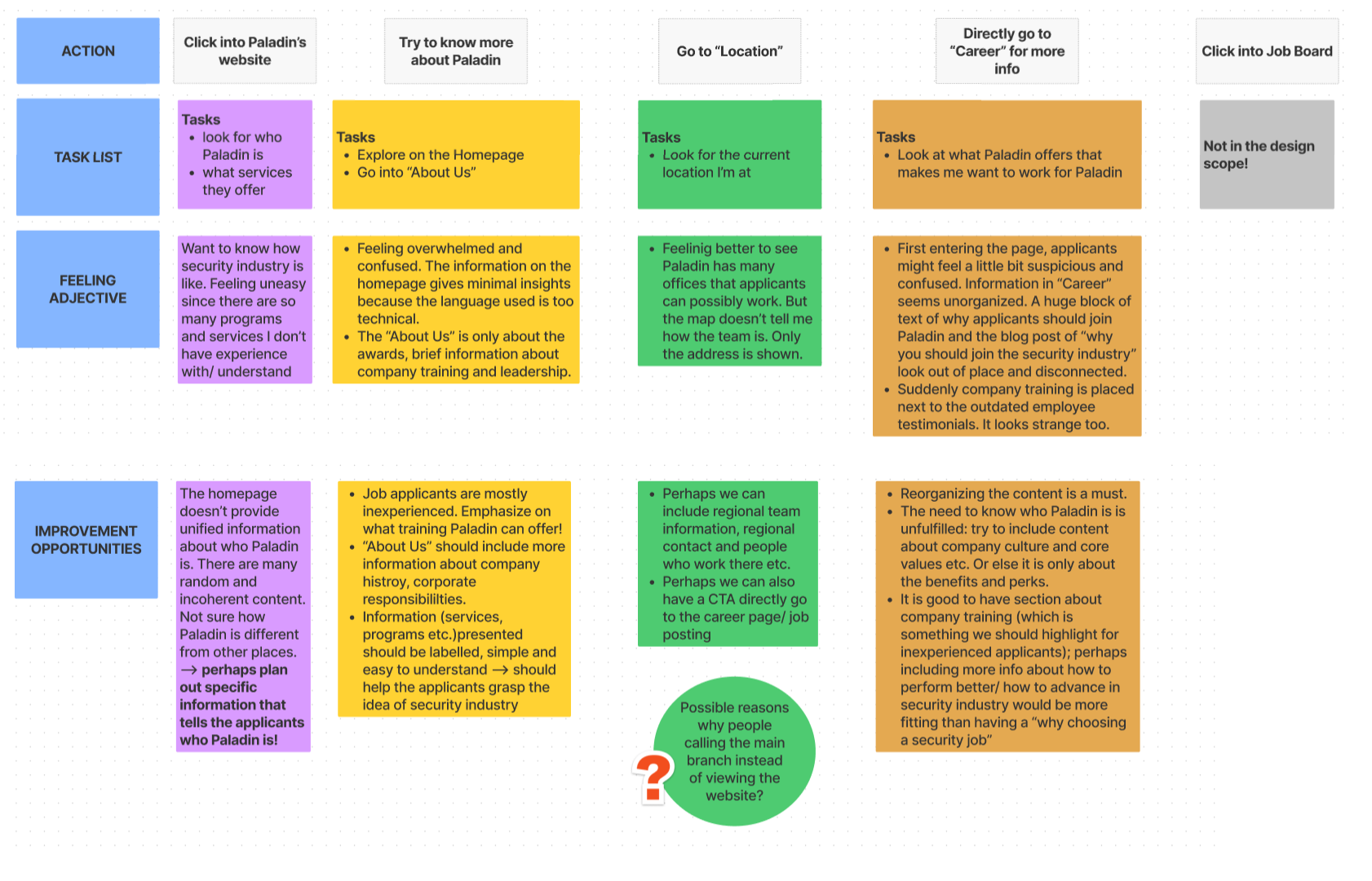
To verify my assumption, I quickly created a user journey map to estimate our applicants' emotions and feelings when browsing our website (Figure 4). The mapping outcome reinforced the low user engagement from the analytics in a way that many of the user expectations were unmet during the website visit. This mapping also helped the team to understand Paladin's content should be more organized and goal-oriented. It should help the viewers understand who Paladin is and how Paladin is able to assist them to advance in the security industry.
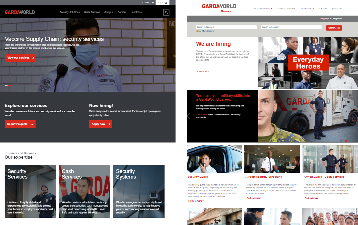
To broaden our perspective, I also decided to conduct an informal competitor analysis. Our competitor, GardaWorld, was likely interacting with the same group of applicants and it would be valuable to study how they arrange and construct their content (Figure 5). On GardaWorld's homepage, they introduce their services, hiring opportunities, company values and office location clearly on their main page. Every content block is there for a reason and is associated with a clear topic. On their career page, they have clear information about what positions they offer as well as further details about their work culture, locations and values. Coming from a visual background, I also did a quick observation on the Paladin’s layouts. Inclusive/diverse photos, clean layouts, accurate descriptions and noticeable primary buttons are needed to improve the current company image.
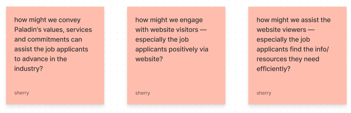
One important aspect of a holistic design mindset is to collaborate horizontally; this idea means designers should involve as many stakeholders as possible in the process to learn about their expectations. That way, the team is able to work towards the same central goal. The reason why the idea of having horizontal collaborations is brought up in this project is we were changing Paladin's digital presence via content and other visual communication opportunities. It is crucial to understand the concerns and visions that the marketing team had at the time. Hence, to best align my vision with the team, I decided to visualize my thought process into several how-might-we questions and communicated them to the marketing team (Figure 6).
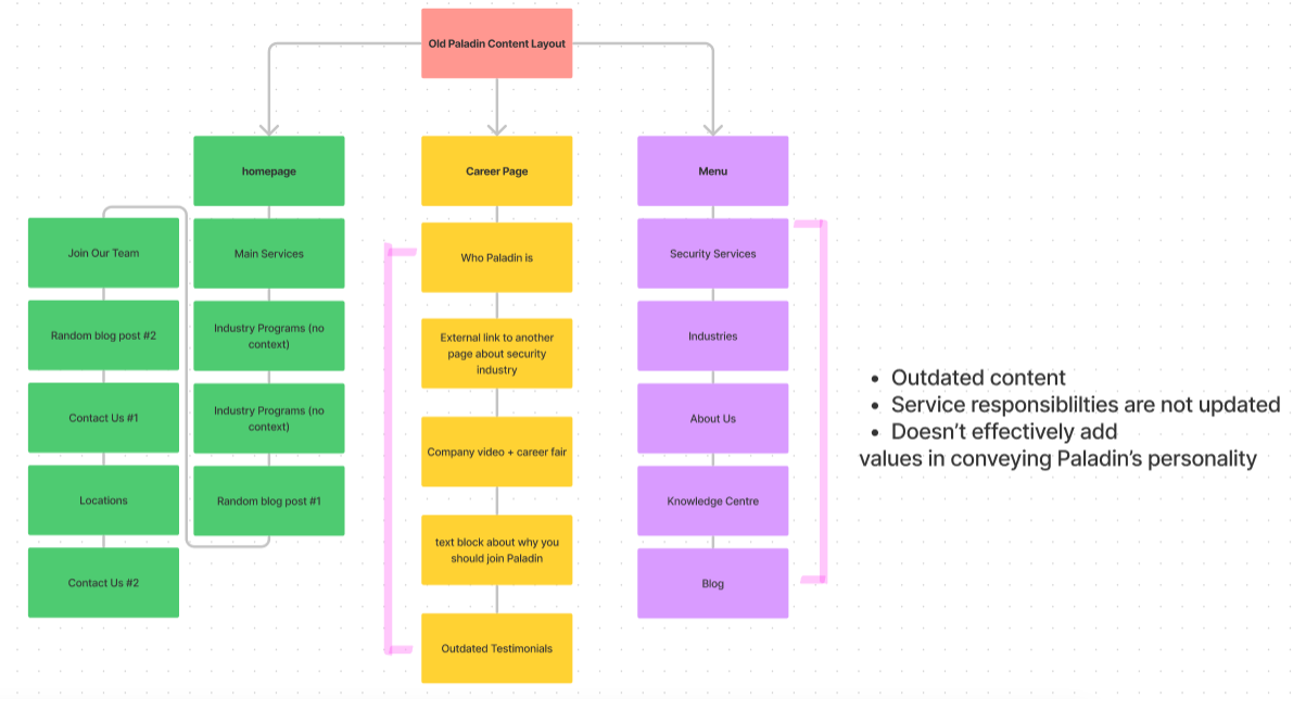
As my first step, I mapped out the old information architecture diagram to pinpoint places that could be improved on both the career page and the homepage. In figure 7, we can notice how the content on the homepage didn't follow a meaningful order. Although the career page had content that was relevant to what the users might be looking for, the order and the relevancy of the content still needed more work because it was outdated and didn't reflect what Paladin could promise to their applicants.
To involve the marketing team, I articulated my estimated user journey map to invite them to re-observe the website user flow and content and ideate from their marketing point of view. What surprised me the most was that we, later on, discovered some services on different parts of the website were a part of Paladin's groups of companies’ responsibilities. This inconsistency might reflect why people tend to call or email the office since the web information isn't reliable. Most importantly, crucial content like company-paid training, Paladin’s commitments, Paladin’s core value — Paladin Difference or other existing blogs that would help the inexperienced applicants to advance in the security industry was unmentioned. These topics can help establish who Paladin is.
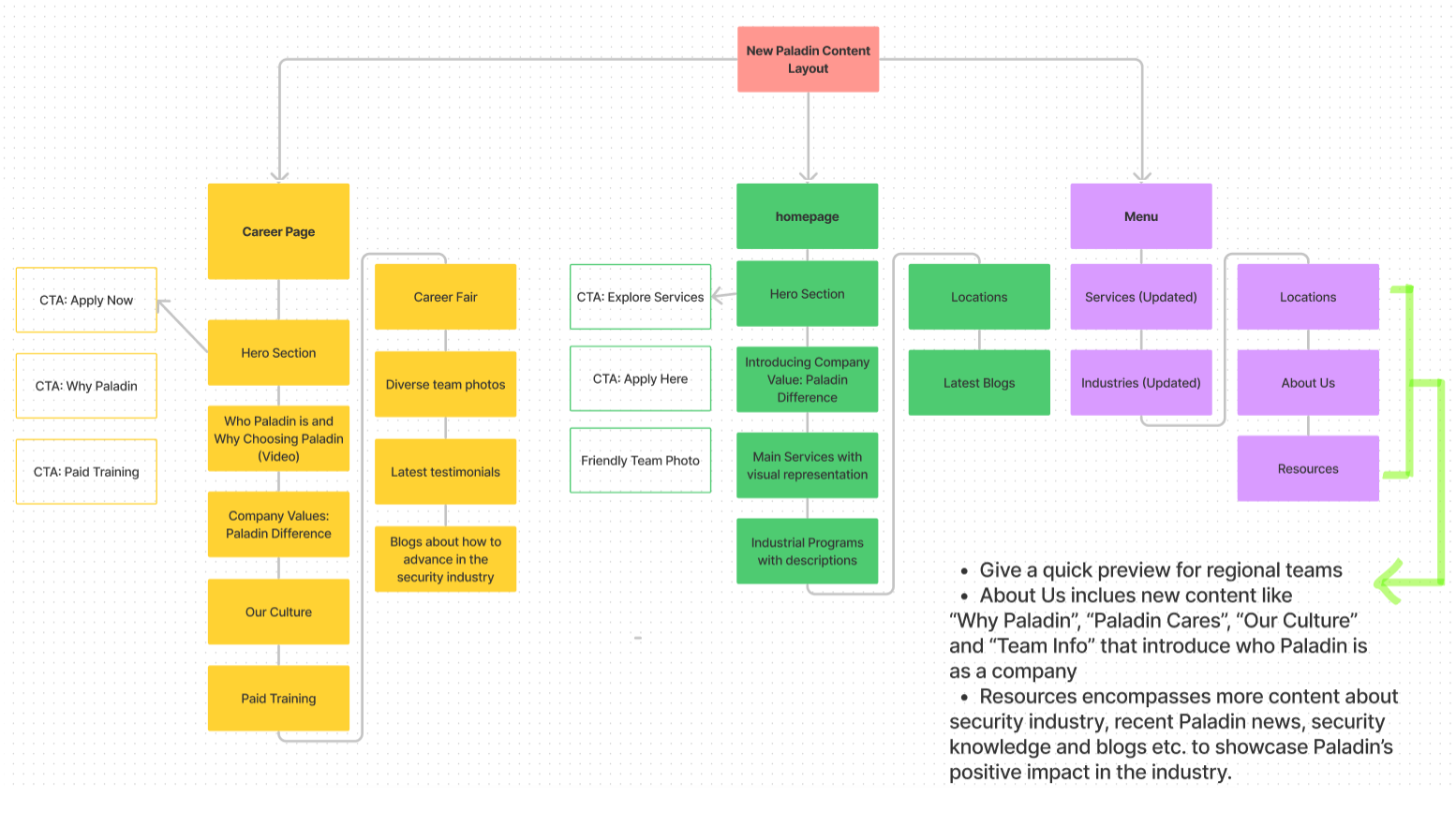
In return, the other marketing team members also introduced the SEO guidelines they usually follow when they craft out Paladin's digital presence. They also considered this website refresh project as a good chance to unify Paladin's digital voice and build a hub to amplify Paladin's influence. We drafted out the new information architecture diagram specifically for the homepage and the career page to fulfill the recruitment purpose (Figure 8) together while also brainstorming other initiatives that could make the website refresh more impactful (Figure 9).
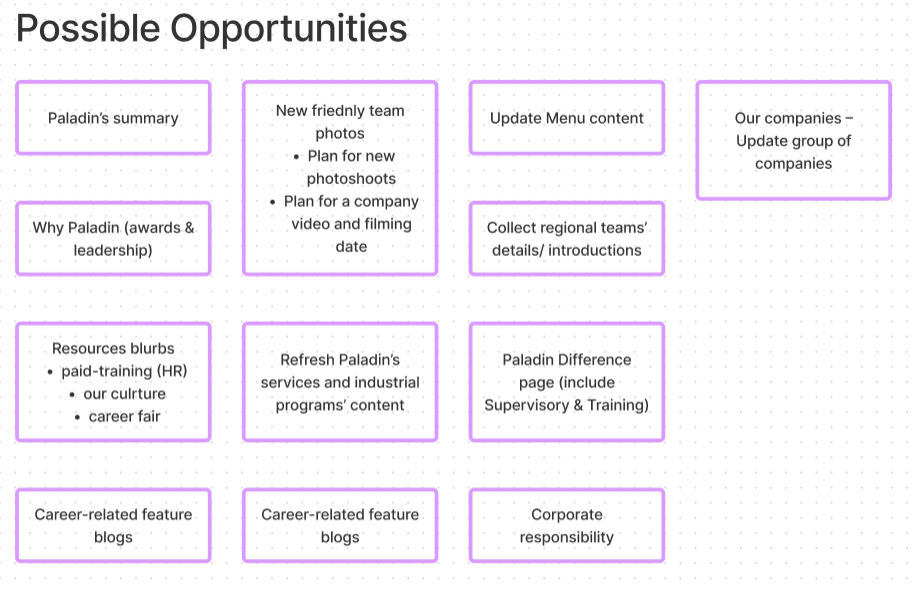
Those initiatives went beyond the original brief — my team members went on to explore the content structure of other pages so as to ensure content consistency. For instance, on the "About Us" and "Locations" page, new content like "Why Paladin", "Paladin Cares", "Our Culture" and regional team information was created; future security knowledge articles and new media such as career/company blog or podcast were also centralized. These new content additions both fulfill the audience's need to understand Paladin while also reinforcing Paladin’s company commitment and values which can help build the trust back. In a sense, it was because of the holistic design mindset and the horizontal collaboration, the plan of refreshing Paladin’s digital impact could be scaled up.
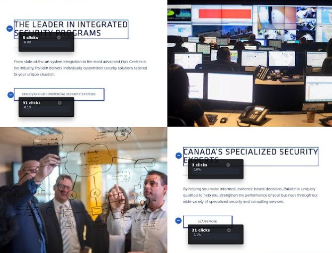
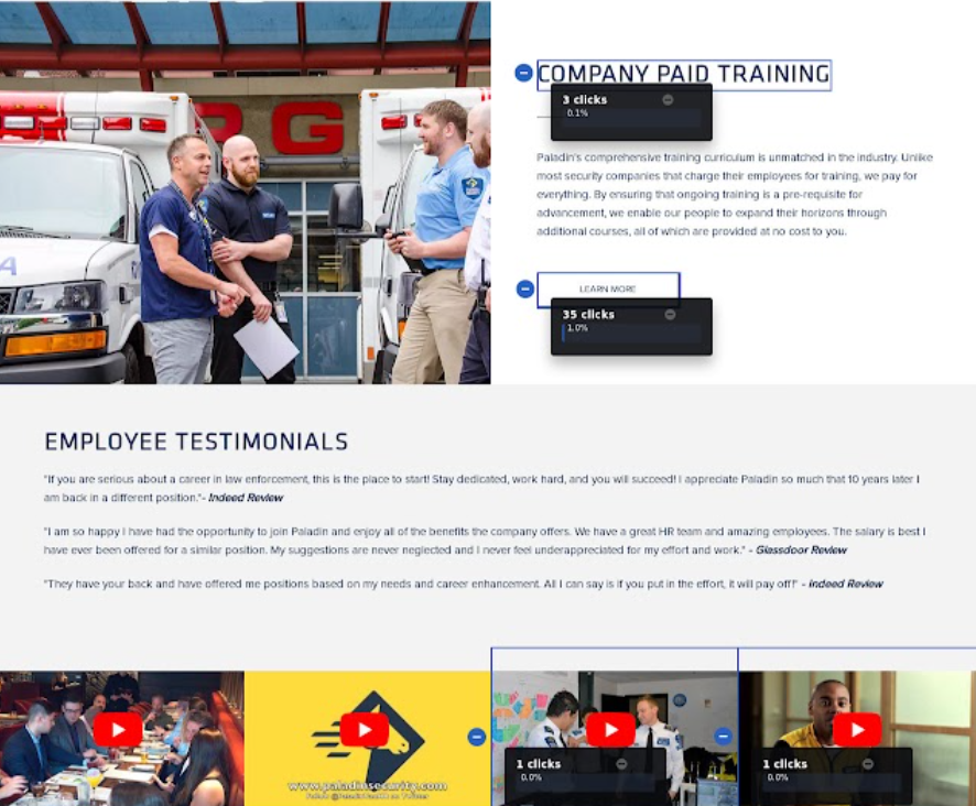
After receiving content structure help, I did a UI audit on the Paladin website and also looked into the website analytics to understand what users might have trouble with. For instance, the service information on the original home page, the buttons weren't obvious enough to show they were interactive (Figure 10). It might confuse a few visitors since a few people might think the titles were clickable; the images on the side of the service description could be confusing to the visitors too since it made the layout clutter together (Figure 10).
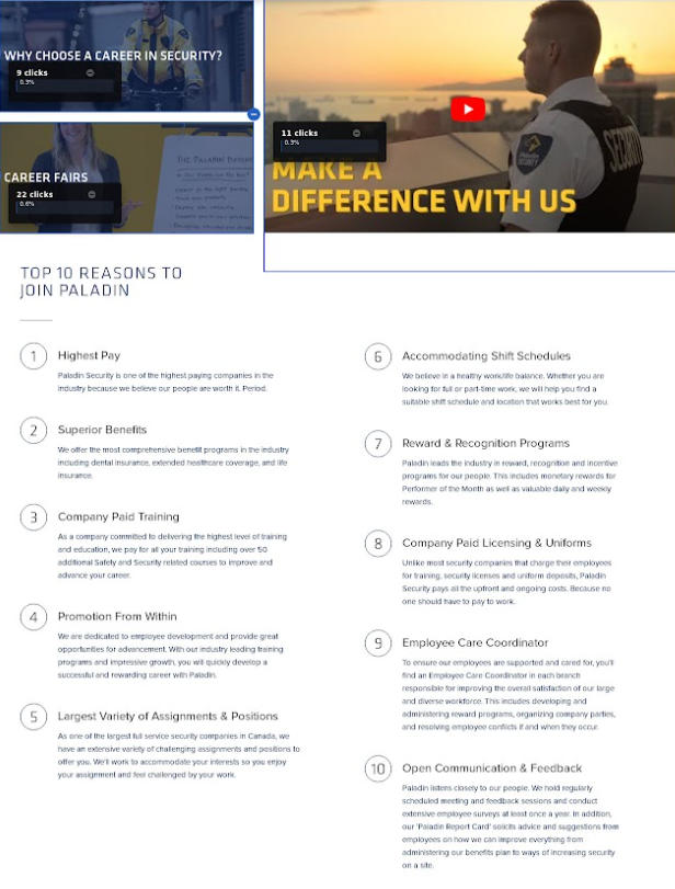
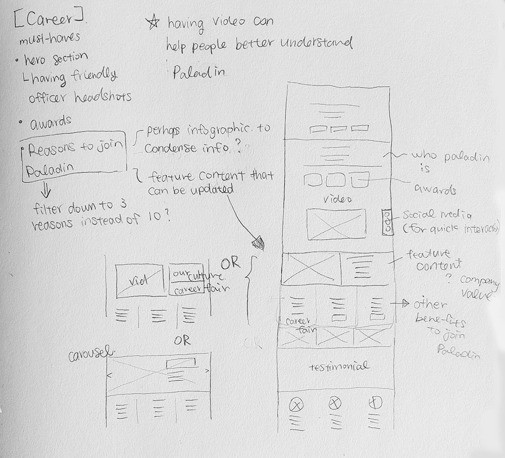
Moreover, on the career page, the information about the security industry, company resources and Paladin's benefits were all cluttered together without clear sections (Figure 11). Similarly, the testimonial videos also weren't properly inviting the web visitors to click on them. The placement also didn't respect web responsiveness (Figure 12). Hence, I developed a few sketch options and brought them to the meetings for revisions (Figure 13).
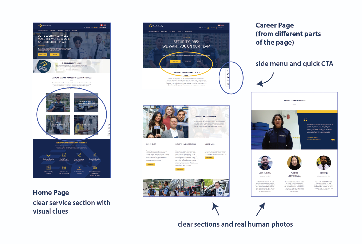
We quickly moved to the mockup process due to the tight deadline; In figure 14, this is a screenshot of multiple snippets of the homepage and career page. On the homepage, we can see the primary buttons give visual hints and can attract visitors to click on them. Paladin's core value is introduced right away to set the tone of Paladin's engagement with the industry; following Hicks’ law to decrease visual distractions, the company's main services are displayed clearly using human photos. This way, it also gives visual hints to people who are new to the security industry — such as our main job applicants — on what Paladin can offer. Although it would be best if we could provide some descriptions of the services, since Paladin's services might increase in the future, this is possibly the simplest layout that can afford any constant change.
On the career page, instead of cluttering every resource together, I broke them up into sections. More diverse team photos are used on the page to highlight Paladin's supportive culture. Testimonials are also introduced with real human photos to help the possible job applicants get a sense of what it's like to work at Paladin. Most importantly, since Paladin's website is content-heavy, I followed one of the heuristic principles where the interface should help the users flexibly navigate; to help web visitors quickly jump to specific topics or preview content, I placed different CTA buttons on the very top. A sidebar with “scroll to top" and social media links is also designed for quick access and interactions.
When I was in the stage of producing high-fidelity mockups, I noticed the team wanted to apply bright aqua blue with white texts on most of the secondary buttons — which is a combination that would not pass the colour accessibility guidelines. I dug into the brand manual to discover that this colour combination was actually what secondary actions were supposed to look like. To further investigate whether our brand colour combinations would pass the colour contrast guidelines, I reached out to my team to see whether the outsourced developer could provide any design system documents. It was surprising that they did not have any documentation. It was at this moment I decided to take on this challenge to create an informal design system documentation for Paladin to enhance website viewers’ experiences.
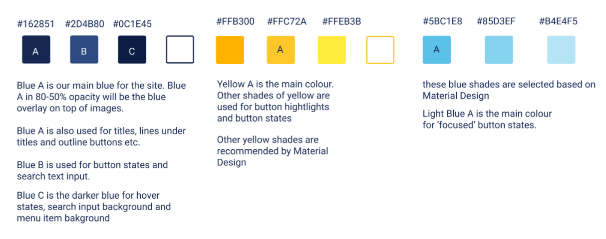
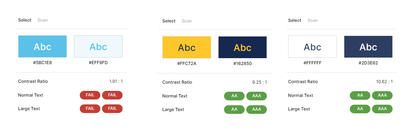
After comparing the brand guidelines and how the website used the brand colours, it was discovered that there was colour inconsistency in the way the website was designed. Initiating self-learning, I studied Material Design's colour guidelines and tested out different shades of the brand colours to unify the colour used on the website (Figure 15). I also finalized and proposed the final colour combinations that could be used as primary/secondary buttons (Figure 16).
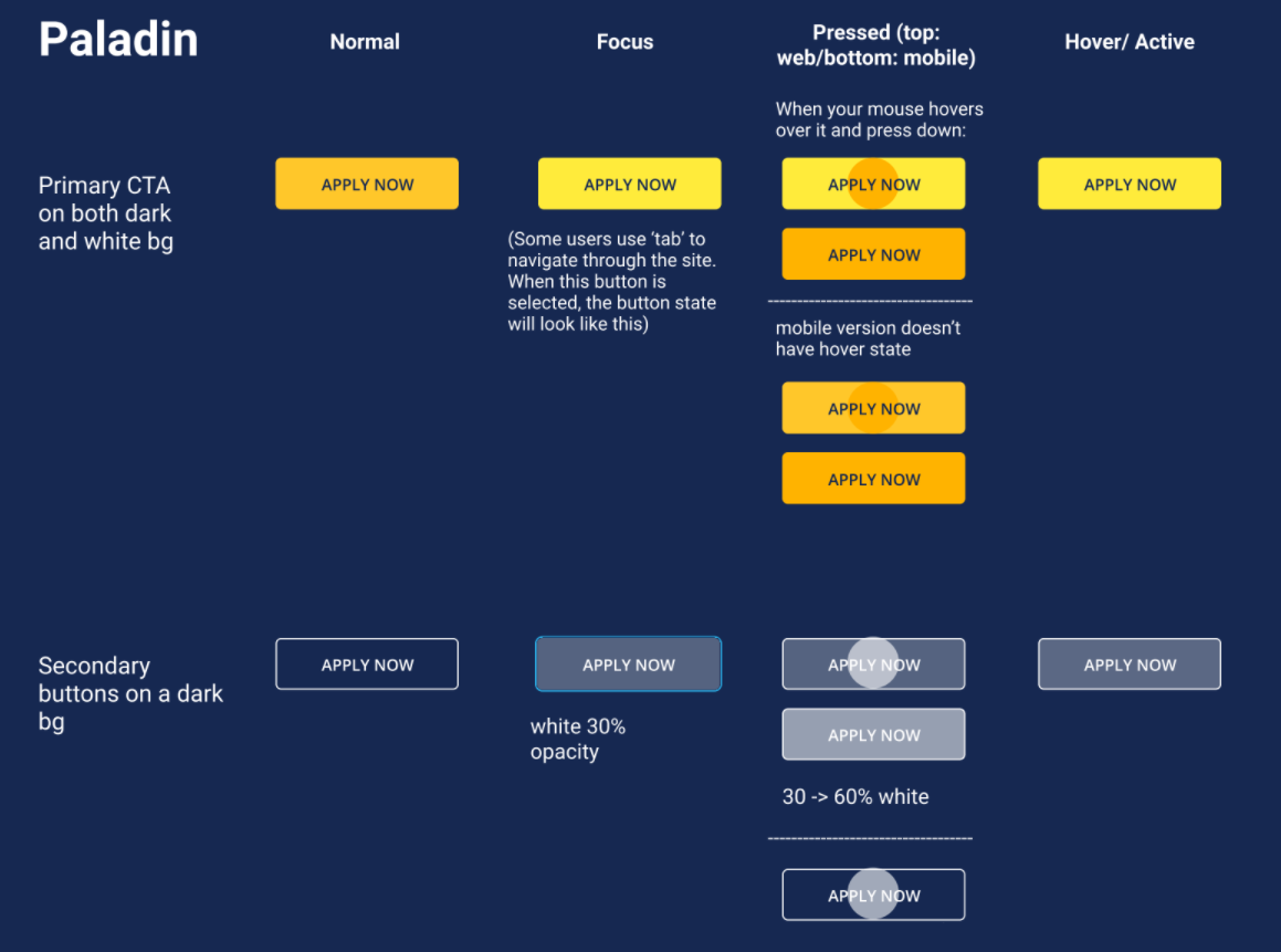
This information was demonstrated in a document (Figure 17). Since Paladin is a more traditional company, I highlighted different button phases and interactions manually for the team to read over. This information was later accepted and passed on for final review.
Our team spent most of our time revamping the desktop version of the website due to time constraints; to decrease the amount of time for iteration, I designed the website with simple layouts so that it would be easier for the outsourced developer to adapt. Nevertheless, during my own time, I decided to fully introduce Figma and its flexible prototyping ability to the team by converting the career page into a mobile version.
In the previous mobile version, the menu was cluttered together; the search function also blended in with the menu option which could be unclear for the users to use. To help the visitors locate what they are looking for, I prioritized the functions that would be used frequently outside the hamburger menu for quick access. To better guide the users using the search function, placeholder text was included to establish search context. In the end, I proposed this mobile design to the team and it was well-received by the team.
Overall, the timeline for this project was tight. It was challenging to work as the only designer in the company since I had to coordinate with cross-team members. It was especially difficult to also work with an outsourced developer since constant communication could be challenging to make. This situation also led to a difficult design handoff process.
Despite these barriers, for the first 2 months after the website went live, the website had a 60% increase in sessions; this outcome might be the result of incorporating new content about Paladin's cultures and opportunities on the website. In other words, people can easily understand who Paladin is and consequently build trust with the company.
As mentioned previously, due to time constraints, confidentiality and budget, we weren't able to contribute time to conduct usability testing. I am currently drafting a survey on my own to see whether the way we have structured our content can truly help our users navigate through the website and understand Paladin's culture and commitments. Perhaps I can further spot other UI or structural pain points to further iterate on the design.